

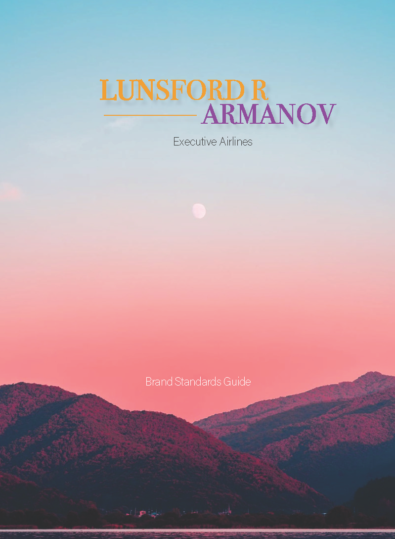
Lunsford R Armanov : A Brand Standards Guide.
A brand standards guide for an executive airline catering to young professionals and clients who enjoy luxury flying experiences.


I created this logo to convey a modern, clean and executive look. The line represents movement, and the placement of the words are meant to resemble an airplane wing.
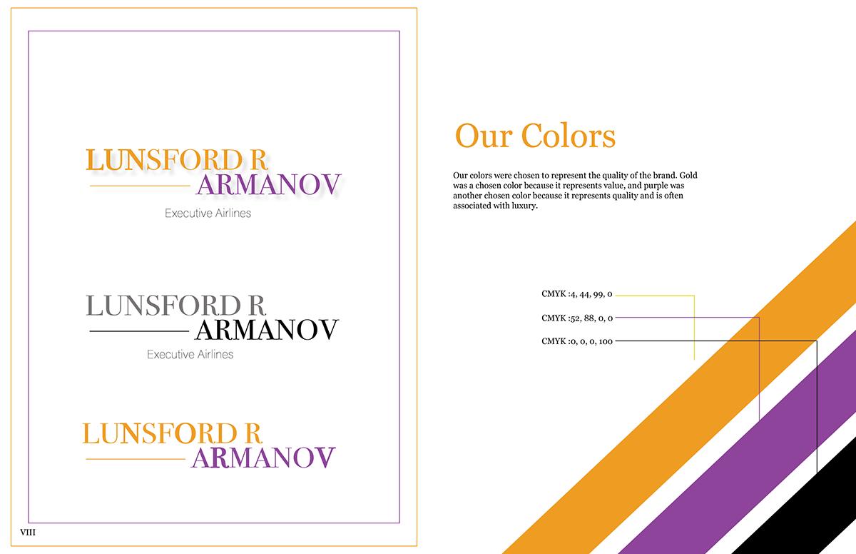
I chose these colors because I wanted the airline to maintain it's executive branding, but also wanted to convey a sense of welcoming; hence why I chose to juxtapose the light orange with the regal purple.

Various logos to illustrate how the logo can be used on products and on business materials.


